The New Xhenon Logo: A Musical Renaissance
You may have noticed that the logo usually found on the left side of the Xhenon website menu is no longer the same. Here is the reason for this change…

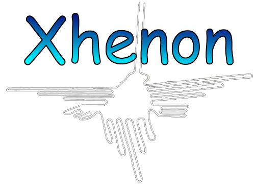
For years, the Xhenon logo featured the Nazca hummingbird, inspired directly by the geoglyph of the same name located in southern Peru (South America). It was discovered in 1927.
A color gradient was added to give it a more stylized look. The logo was used for merchandise—mainly 32 mm badges. It accompanied all visual illustrations of Xhenon: music videos, banners, images for social media, etc.
However, 2025 marks a rebirth. After several difficult years, my musical activities related to Xhenon are rising from the ashes, and I have more projects than ever before. The new CD album, which I will discuss in more detail very soon, is a perfect example.

So I needed another logo that was more representative. It had to be more in line with my values and my way of perceiving the world. Of course, above all, it had to represent my musical universe. This is generally linked to nature but also quite futuristic due to my use of synthesizers.
t would have been easier to choose a phoenix to symbolize this rebirth. But isn’t that a little too easy? I remembered another logo I had created a long time ago. Admittedly, it may seem strange, but for me its meaning is very important. In fact, it represents important positive and creative values.
I have named this “new” logo Creative Kindness. It will now appear on all Xhenon graphics.

Please note: The illustration used at the top of the article was partly generated by AI.

